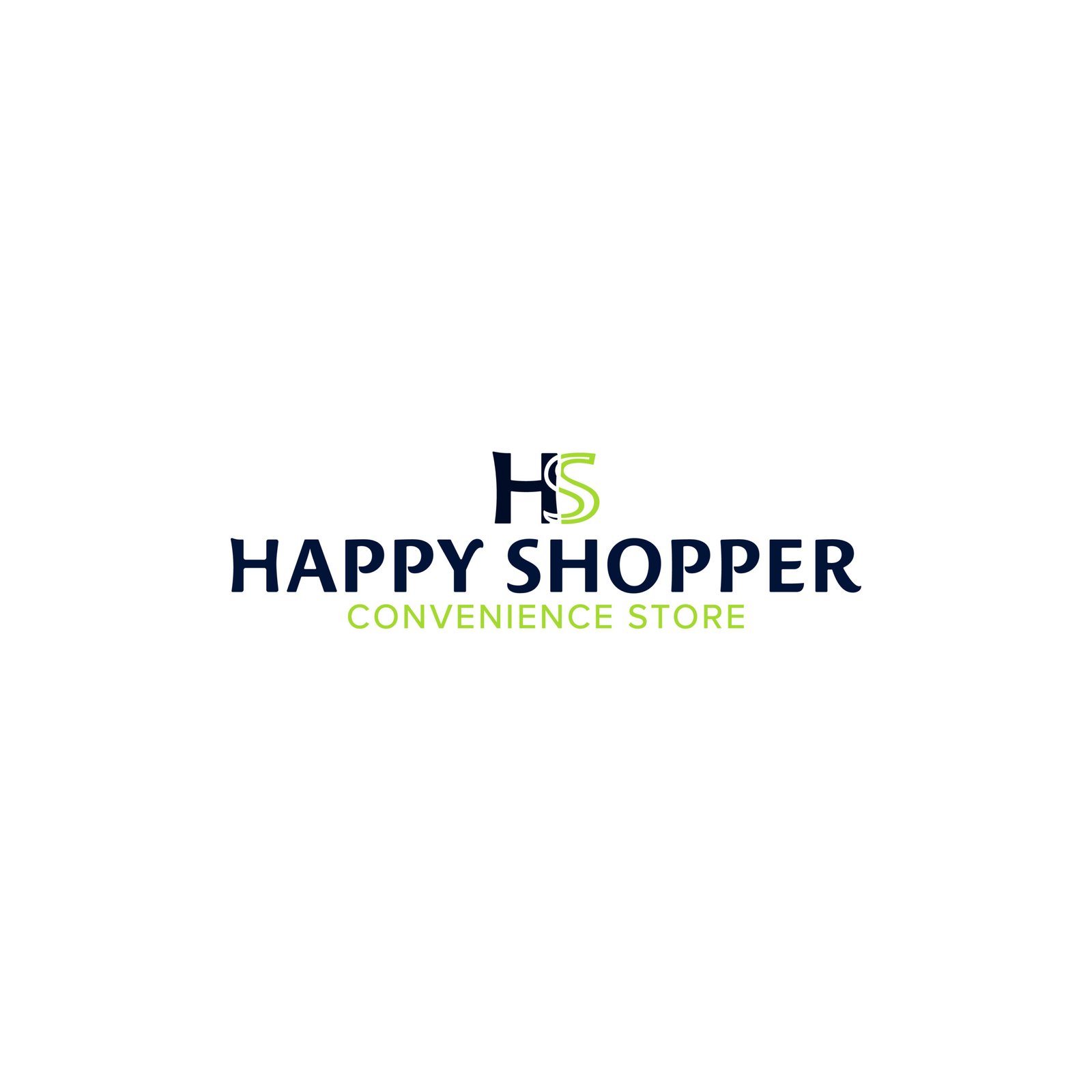
Happy Shopper Branding was crafted to resonate with both family shoppers and younger generations, blending energy with modern appeal. The project presented the challenge of standing out in a highly competitive market dominated by well-established brands.
Create a brand that embodies high-quality and a contemporary and elegant presentation.
Developing a typeface that integrated Japanese headband motifs was challenging. The solution was a simplified, harmonious design that balanced tradition and readability
Imagery:
Imagery focuses on bright, inviting visuals that highlight the freshness of products while maintaining an energetic presentation. Clean, well-lit product photos paired with minimalistic backgrounds help reinforce the brand’s commitment to quality and convenience, making the store feel both accessible and premium.
Shape and Layout:
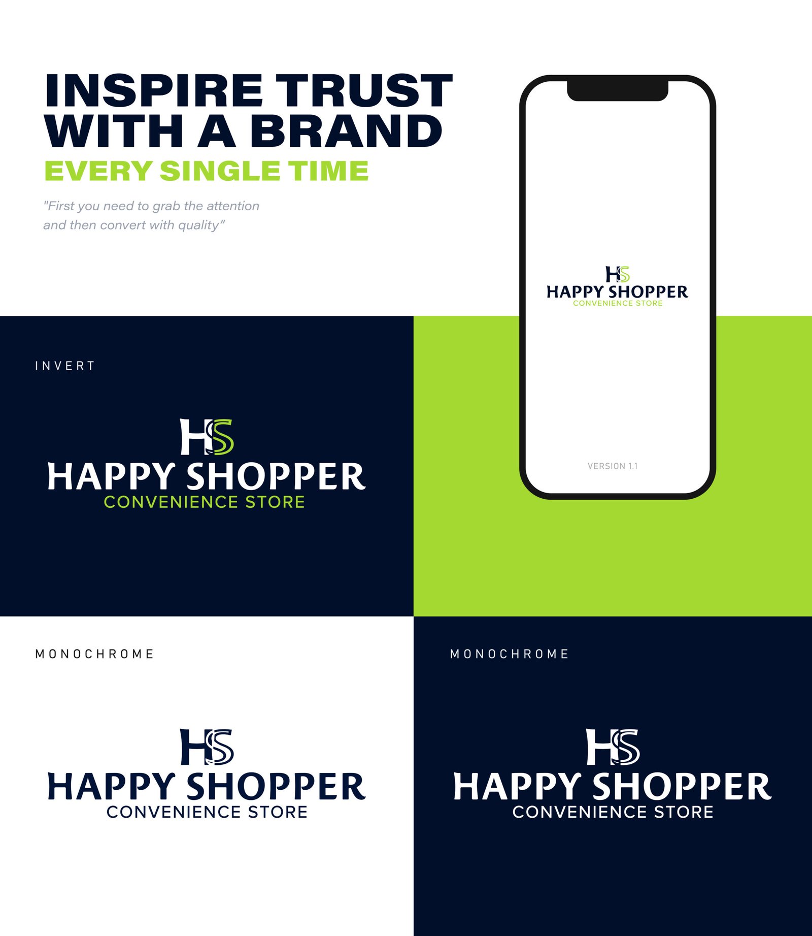
The layout utilizes clean lines and structured grids to ensure clarity and simplicity. Rounded edges in packaging and design elements subtly convey a sense of friendliness, while maintaining a sleek, professional appearance. The balance of white space and structured shapes allows the vibrant colors and product visuals to stand out, enhancing the brand’s visual appeal.
Colors:
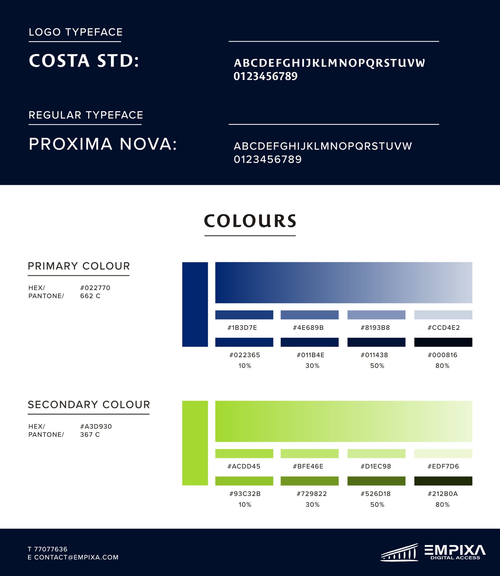
The color palette reflects a blend of elegance and freshness, crucial for a brand aiming to position itself at a higher competitive level. The primary green shades symbolize vitality and freshness, resonating with the grocery theme, while the secondary dark tones add depth and sophistication, balancing the friendly aesthetic with a premium feel.
Typography:
The logo uses a bold and approachable typeface that evokes familiarity, reminiscent of everyday household brands. This is paired with matching typefacefor regular text, offering a modern, clean look that maintains readability and a friendly tone across all brand materials.
The results
The balance between friendly, approachable design elements and a sleek, energetic aesthetic reinforced the brand’s commitment to quality while remaining accessible and budget-friendly.
Let’s Make Your Business Great Together
We know we can push boundaries.
Claim Your Free Consultation
Empixa – Brand Development: Your partner in growth.
We specialize in delivering innovative and strategic solutions that drive financial success.